If you have ever logged in to a new Salesforce org and felt that it doesn’t match the company’s branding, you are not alone.
By default, Salesforce uses the standard blue Lightning header, Salesforce cloud logo, and its default color theme. While it works perfectly, it may not reflect your company’s brand identity.
The good thing is that Salesforce provides several built-in branding and customization options in Lightning Experience.
Using these Setup options, you can customize the header bar, company logo, colors, navigation, and overall user experience without writing any code.
In this tutorial, I’ll show you how to customize the Salesforce Lightning header bar from top to bottom: the logo, header color, app icon, navigation layout, and even the login page branding.
I’ll also cover what you can take further with a custom LWC component when the native options aren’t enough.
What You Can Customize in Salesforce Lightning Header
Before moving to the steps, it’s important to understand what parts of the Salesforce Lightning header bar you can customize.
The Lightning header bar contains multiple sections, and Salesforce provides customization options at different levels for each section.
| Header Element | Can You Customize It? | How |
|---|---|---|
| Header background colour | ✅ Yes | Themes & Branding |
| Company logo/brand image | ✅ Yes | Themes & Branding |
| App icon (the coloured square next to the app name) | ✅ Yes | App Manager |
| App name label | ✅ Yes | App Manager |
| Navigation tabs and order | ✅ Yes | App Manager |
| Global search bar | ❌ No (position/style fixed) | — |
| Bell notification icon | ❌ No (Salesforce-controlled) | — |
| User avatar (top-right) | ✅ Partially | User profile settings |
| Login page branding | ✅ Yes | Themes & Branding |
| Page background color | ✅ Yes | Themes & Branding |
| Link and button colors | ✅ Yes | Themes & Branding |
Understanding this in advance can save you a lot of time, because some parts of the Salesforce Lightning header bar are controlled by Salesforce and cannot be fully customized.
1. Customize the Header Color, Logo, and Org-Wide Branding
This is one of the most noticeable customizations you can make in Salesforce Lightning Experience.
Once you update the header color and brand image and activate the theme, the changes are immediately applied across the entire org for all users on every page.
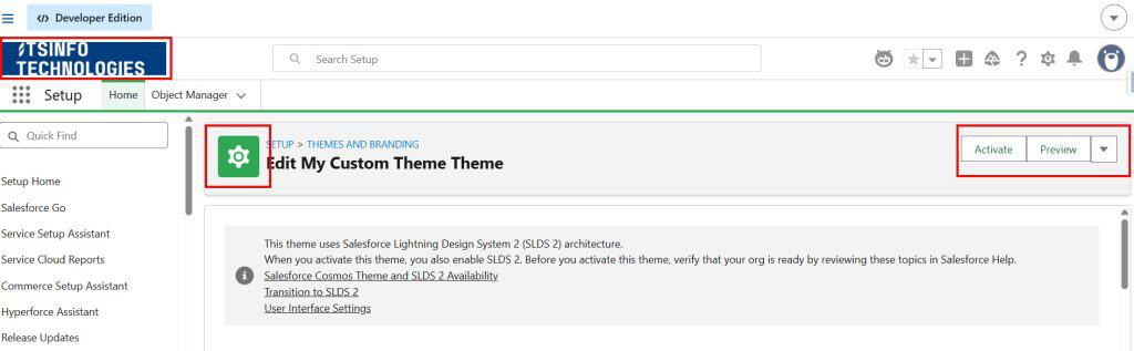
1.1 – Open Themes and Branding
Click the gear icon (⚙️) and select Setup. In the Quick Find box, type Themes and Branding and click Themes and Branding from the results.
You’ll see a list of all themes in your org — Salesforce ships several pre-built themes you can browse and activate. But for proper branding, you’ll want to create your own.
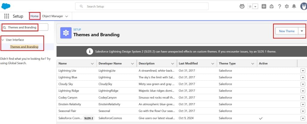
1.2 – Create a New Custom Theme
Click the New Theme button and enter a meaningful theme name, such as Acme Corp Theme or Internal Branding 2025.
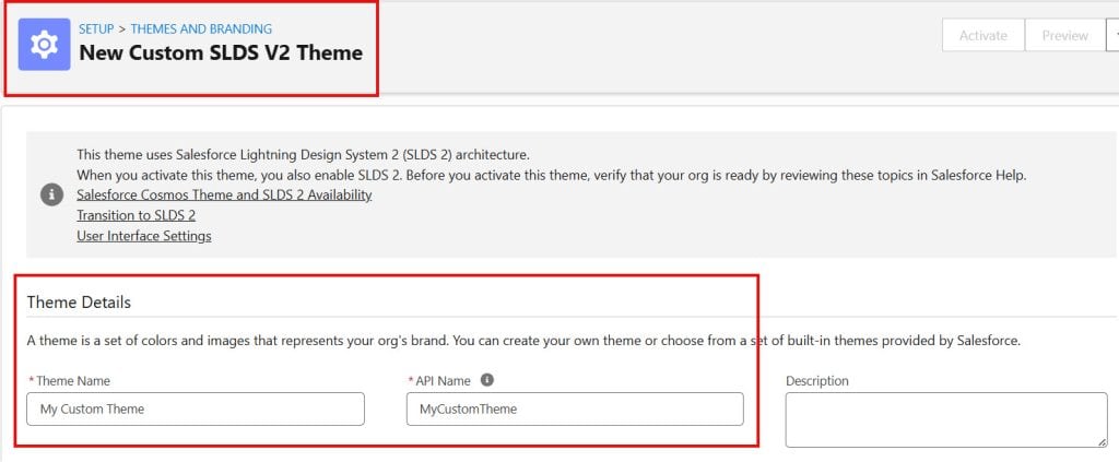
After that, Salesforce displays multiple branding settings that allow you to customize the Lightning Experience interface. Here’s what each option is used for:
| Setting | What It Does |
|---|---|
| Theme Name | Internal label — users don’t see this |
| Brand Image | Your company logo displayed in the header bar (recommended size: 200×55px, transparent PNG) |
| Brand Color | The background color of the header bar — enter a hex code like #003366 |
| Page Background Color | The background color of all Lightning pages |
| Page Background Image | An optional background image behind the page content |
| Default Group Banner | Default banner image for Chatter groups |
| Default Group Avatar | Default avatar for Chatter groups |
| Default User Banner | Default banner image on user profile pages |
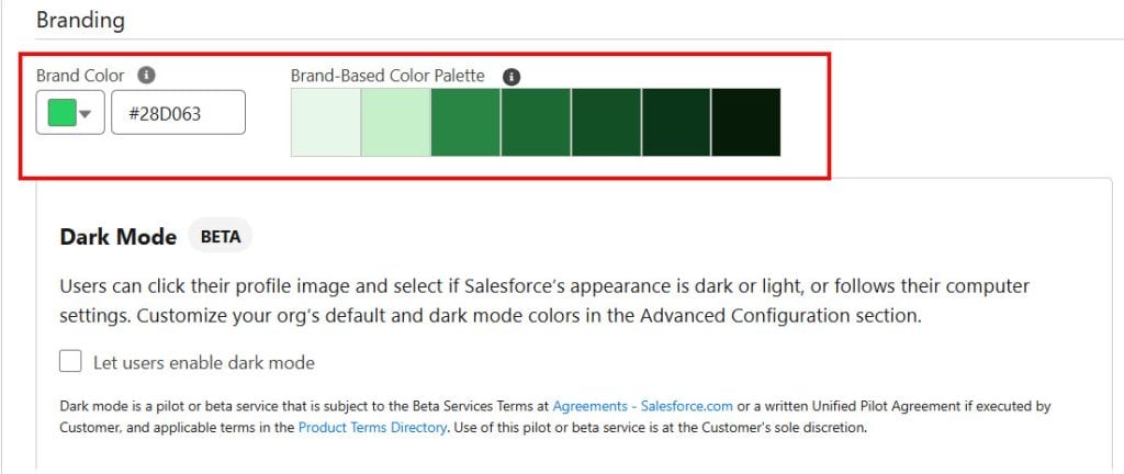
1.3 – Set Your Brand Color (Header Background)
Click the color picker next to Brand Color and either pick a color from the palette or type your company’s hex code directly.
This sets the background color of the entire top header bar, the most visible branding change you can make.
A few things to keep in mind:
- Contrast matters for accessibility — make sure your navigation tab text remains readable against the color you choose. Salesforce adjusts the tab text to light or dark automatically, but very mid-range colors (like certain greens or yellows) can create contrast issues
- Test in preview before activating — click the Preview button after setting your colors to see how everything looks before it goes live
1.4 – Upload Your Brand Image (Logo)
Click the Upload File button next to Brand Image. Choose your company logo file from your computer.
A few tips for the logo file:
- Use a transparent PNG — it blends cleanly against any header background color
- The recommended dimensions are 200×55 pixels. Larger files get scaled down automatically, but can look blurry
- Keep the file size small (under 100KB) — it loads on every page for every user
- Test against both light and dark header colors if your org uses multiple themes
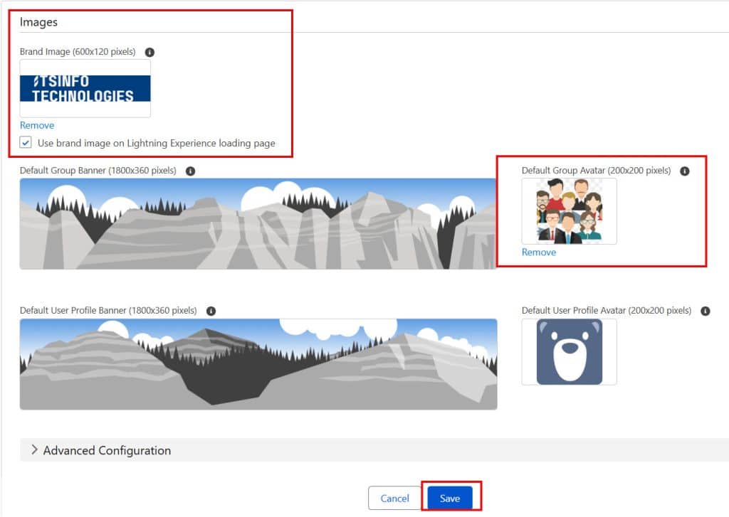
1.5 – Preview and Activate the Theme
Once you’ve set the brand image, brand color, and any other options, click Save. Salesforce saves the theme but doesn’t apply it yet.
You’ll be taken back to the Themes and Branding list, where you’ll see your new theme with a Preview option. Click Preview to see how it looks in a sandboxed view of your org.
When you’re happy with it, click the dropdown arrow on your theme row and select Activate. The theme goes live immediately for all users in the org — no deployment, no release, just instant activation.
2. Add a Custom App Icon and App Name in the Header
The Salesforce header shows the current app name next to the App Launcher icon.
You can replace the generic icon with a custom-coloured square and a custom label for each Lightning App you’ve built.
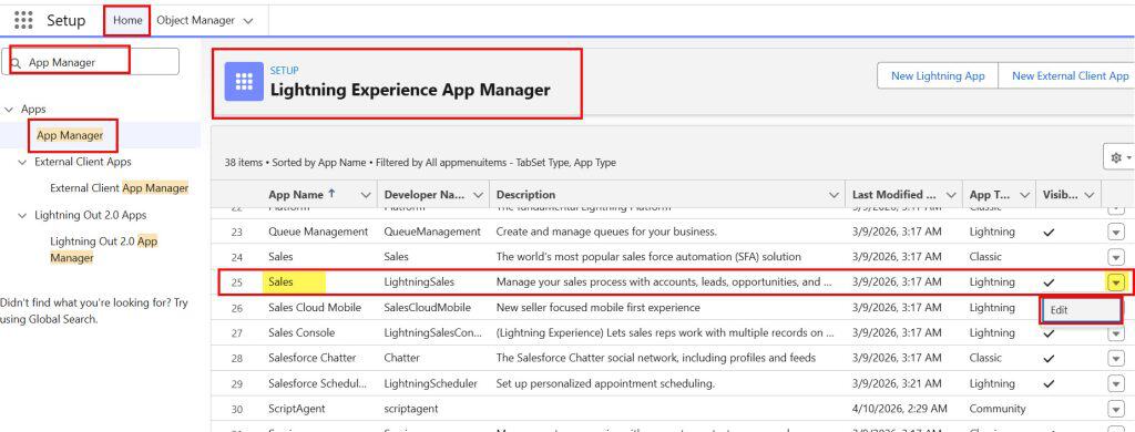
2.1 – Open App Manager
Go to Setup → App Manager (type App Manager in Quick Find).
Find the Lightning App you want to rebrand and click the dropdown arrow on the right side of its row. Select Edit. Here, I selected the Sales app.
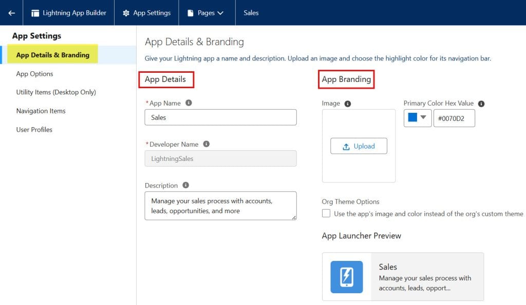
2.2 – Update App Details and Branding
You’ll land on the App Details & Branding step of the app editor. Here you can:
- App Name — change what shows up in the header and App Launcher
- Developer Name — the API name (doesn’t affect the UI)
- Description — appears in the App Launcher as a subtitle
- App Logo — a small image displayed in the App Launcher tile (recommended: 128×128px, square PNG)
- Primary Color — the hex color for the icon background square displayed in the header
- App Icon — pick from Salesforce’s built-in icon library for the header badge
Click through the remaining steps (no changes are needed unless you want to update the navigation too), then click Save & Finish.
The new app name and icon color will show immediately in the header when users open that app.
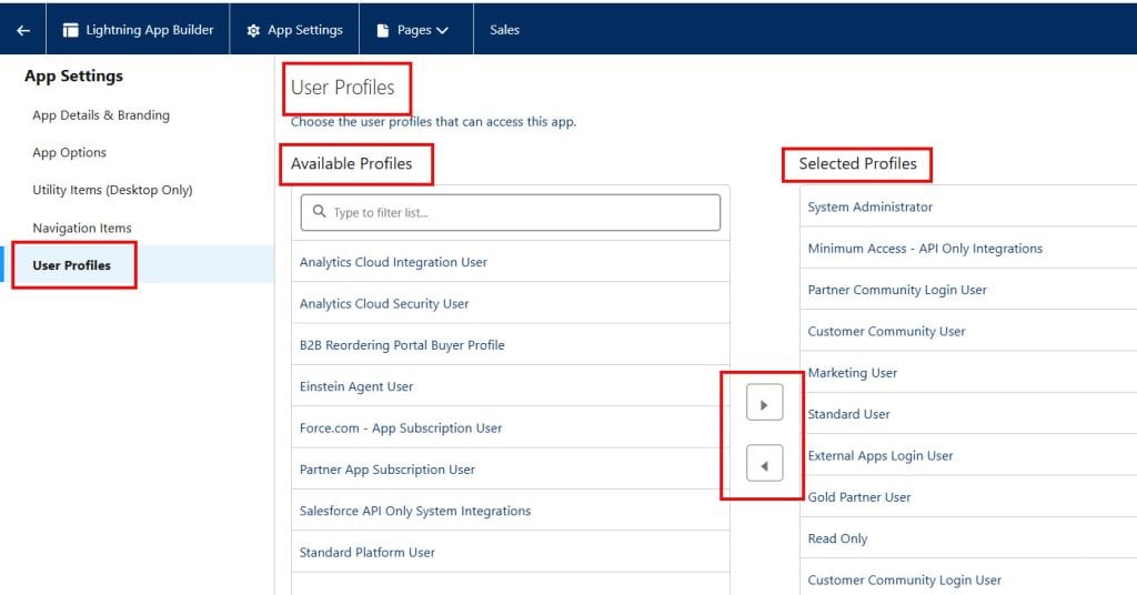
3: Customize the Header Navigation Tabs
The tabs that appear in the Lightning header navigation bar are controlled per app, not globally.
This means you can have completely different navigation setups for different teams using different apps.
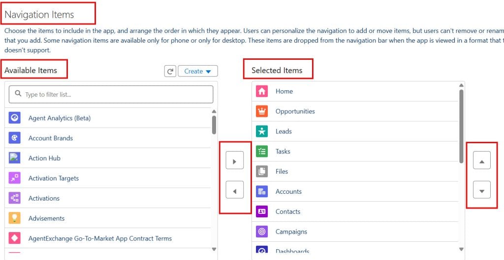
3.1 – Edit the App’s Navigation Items
In Setup → App Manager, find your app, click the dropdown arrow, and select Edit. Click through to the Navigation Items step (it’s step 4 in the wizard).
You’ll see:
- Available Items (left column) — everything in your org that can be added
- Selected Items (right column) — what currently appears in the nav bar
3.2 – Add, Remove, and Reorder Tabs
- To add a tab: click the item in the left column and click the right arrow, or drag it across
- To remove a tab: select it in the right column and click the left arrow
- To reorder tabs: drag items up and down in the right column — the top item becomes the leftmost tab in the header
The navigation bar in the header shows tabs left to right in the same order as your Selected Items list from top to bottom.
3.3 – Control Tab Visibility Per Profile
Want different teams to see different navigation tabs without creating separate apps? The cleanest approach is to create one app per team role and assign each app to the relevant profiles.
See the full guide on this in our Navigation Menu tutorial for step-by-step profile assignment instructions.
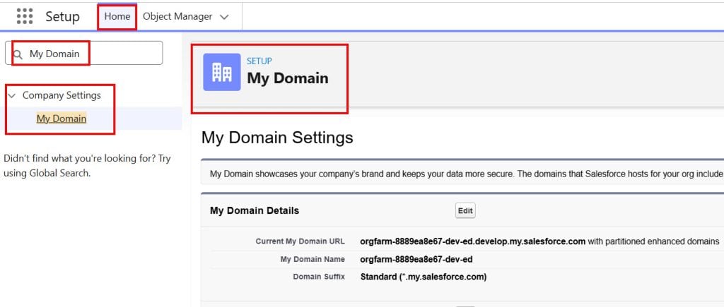
4. Customize the Login Page Branding
Your login page is the first thing users (and clients, if you have a portal) see. Salesforce lets you brand this page too — separate from the in-app header branding.
4.1 – Open My Domain Settings
Go to Setup → My Domain (type My Domain in Quick Find).
Your org needs to have a custom My Domain set up for login page branding to work. If you haven’t configured My Domain yet, you’ll need to do that first.
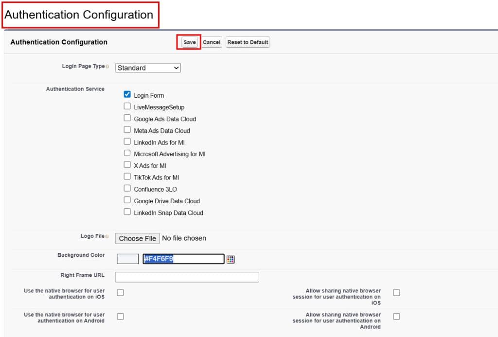
4.2 – Edit Login Page Branding
Scroll down to the Authentication Configuration section and click Edit.
Under Login Page Branding, you can customize:
- Logo Image — uploaded image displayed above the login form (max 100KB, shown at 240px wide)
- Background Color — hex color for the full login page background
- Right Frame URL — an optional iframe showing a web page on the right side of the login screen (useful for displaying company news or announcements)
- Footer Text — custom text shown at the bottom of the login page
Click Save when done.
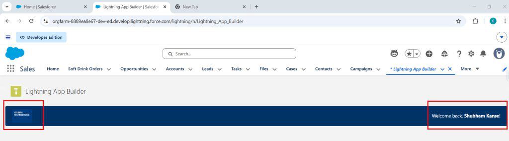
5. Going Further with a Custom LWC Header Component
Salesforce’s built-in branding tools cover most use cases. But if you need something the native Themes & Branding can’t provide — like a dynamic banner that shows the user’s name, department, or a custom welcome message — you can build a custom LWC component and place it at the top of every page using Lightning App Builder.
Here’s a practical example that renders a branded header bar with the logged-in user’s name:
HTML File — customBrandedHeader.html
<template>
    <div class="branded-header">
        <div class="brand-logo-section">
            <img src={logoUrl} alt="Company Logo" class="company-logo" />
        </div>
        <div class="welcome-section">
            <p class="welcome-text">Welcome back, <strong>{userName}</strong>!</p>
            <p class="user-dept">{userDepartment}</p>
        </div>
    </div>
</template>
CSS File — customBrandedHeader.css
.branded-header {
    display: flex;
    align-items: center;
    justify-content: space-between;
    background-color: #003366;
    padding: 10px 20px;
    border-radius: 4px;
}

.company-logo {
    height: 40px;
    width: auto;
}

.welcome-text {
    color: #ffffff;
    font-size: 14px;
    margin: 0;
}

.user-dept {
    color: #aac4e0;
    font-size: 12px;
    margin: 2px 0 0 0;
}
JavaScript File — customBrandedHeader.js
import { LightningElement, wire } from 'lwc';
import { getRecord } from 'lightning/uiRecordApi';
import USER_ID from '@salesforce/user/Id';
import NAME_FIELD from '@salesforce/schema/User.Name';
import DEPT_FIELD from '@salesforce/schema/User.Department';
import LOGO from '@salesforce/resourceUrl/CompanyLogo'; // upload logo as a Static Resource

export default class CustomBrandedHeader extends LightningElement {
    userId = USER_ID;
    logoUrl = LOGO;

    @wire(getRecord, {
        recordId: '$userId',
        fields: [NAME_FIELD, DEPT_FIELD]
    })
    userRecord;

    get userName() {
        return this.userRecord?.data?.fields?.Name?.value || 'there';
    }

    get userDepartment() {
        return this.userRecord?.data?.fields?.Department?.value || '';
    }
}
Meta XML — customBrandedHeader.js-meta.xml
<?xml version="1.0" encoding="UTF-8"?>
<LightningComponentBundle xmlns="http://soap.sforce.com/2006/04/metadata">
    <apiVersion>62.0</apiVersion>
    <isExposed>true</isExposed>
    <targets>
        <target>lightning__AppPage</target>
        <target>lightning__HomePage</target>
    </targets>
</LightningComponentBundle>
To use this component, first upload your company logo as a Static Resource in Setup (search Static Resources, click New, upload your PNG file, and name it CompanyLogo).
Then deploy the component and drag it to the top of your Home Page or App Page in Lightning App Builder.
Logo Specifications Cheat Sheet
Here’s a quick reference for every logo and image you might need across your Salesforce branding setup:
| Location | Recommended Size | Format | Notes |
|---|---|---|---|
| Header Brand Image (Themes & Branding) | 200×55px | PNG (transparent) | Main header logo |
| App Launcher App Logo | 128×128px | PNG (square) | Shows in the App Launcher tile |
| Login Page Logo | 240px wide max | PNG or JPG | Max 100KB file size |
| LWC Static Resource Logo | Flexible | PNG (transparent) | Optimize for web (under 50KB) |
| Chatter Group Banner | 1500×500px | PNG or JPG | Appears on group page |
| User Profile Banner | 1500×500px | PNG or JPG | Appears on the user profile page |
Common Issues and Fixes Related to Salesforce UI
❌ Brand image isn’t showing in the header after activation
The most common cause is a white logo on a white or very light background — you can’t see it.
Switch to a transparent PNG and ensure the logo has sufficient contrast against your brand color. Also, please confirm that the theme is set to Active and not just saved.
❌ The header color looks different between my laptop and a colleague’s screen
Monitor color calibration and browser rendering can cause slight differences. Always test your brand color on multiple screens before rolling out.
Stick to solid, neutral corporate colors (deep blues, greens, or charcoals) rather than bright or pastel colors that shift dramatically between displays.
❌ I activated the theme, but some users still see the old one
Ask affected users to do a hard refresh (Ctrl+Shift+R on Windows, Cmd+Shift+R on Mac). Salesforce caches theme assets in the browser.
A hard refresh forces the browser to reload the page from the latest version.
❌ The app icon color I set in App Manager isn’t showing in the header
Make sure you’ve entered the hex code correctly in the Primary Color field — it must be a valid 6-character hex code with the # prefix (e.g., #0070D2). Invalid hex codes are silently fallback to the default color.
❌ Logo appears blurry or stretched in the header
The brand image field in Themes & Branding constrains images to fit the header height (~40px tall). If your original image is too small, it gets upscaled, which makes it look blurry. Always start with an image at least 200px wide.
If it still looks blurry, try exporting your logo at 2x resolution (400×110px) — it’ll render more crisply on high-DPI screens.
❌ My LWC-branded header isn’t inheriting the Theme & Branding color
Your CSS in the LWC component is completely independent from Salesforce’s Themes & Branding.
If you want your custom component’s background to always match the active theme’s brand color, you can either hardcode the brand color in the component’s CSS or use SLDS design tokens.
The easiest approach is to hardcode the hex in the CSS and update it if your brand color ever changes.
Branding Tips That Actually Make a Difference
- Keep your header color consistent with your website and internal tools. Users move between systems all day — a familiar color builds trust and makes Salesforce feel like it belongs in your toolkit.
- Use one theme for internal users and a separate one for any portal or community. External-facing portals often have different brand requirements than your internal org.
- Always test in a Sandbox before applying to Production. Themes and Branding changes apply org-wide instantly. Get sign-off from stakeholders on a sandbox first.
- Check accessibility contrast. Salesforce automatically adjusts nav text to light or dark to maintain readability, but test with real users if you’re using unusual brand colors.
- Don’t overdo the page background color or image. A subtle off-white or light grey works better than a bold background — Salesforce’s UI has a lot of white cards and panels, and a busy background makes everything look cluttered.
Key Takeaways
- All org-wide header branding — color, logo, page background — is controlled through Setup → Themes & Branding
- Create a New Theme, set your brand color, and upload your logo, preview it, then activate it to go live instantly
- For logos, use a transparent PNG at 200×55px for the header brand image — it blends cleanly against any background color
- App icons and names in the header are set per app in Setup → App Manager → Edit → App Details & Branding
- Navigation tabs in the header are controlled per app in Setup → App Manager → Edit → Navigation Items
- Login page branding is separate and configured through Setup → My Domain
- When native branding options aren’t enough, build a custom LWC component with your brand styles and place it at the top of pages using Lightning App Builder
- Always preview your theme and test on multiple screens before activating in Production
You may like to read:
- Salesforce File Upload Using Visualforce and Apex
- Create Dynamic Forms in Salesforce
- What is SFDC in Salesforce?
- Headless 360 in Salesforce
- Freeze User Account Using Salesforce Flow
- Display Alerts and Notifications in Salesforce UI Header
I am Bijay Kumar, the founder of SalesforceFAQs.com. Having over 10 years of experience working in salesforce technologies for clients across the world (Canada, Australia, United States, United Kingdom, New Zealand, etc.). I am a certified salesforce administrator and expert with experience in developing salesforce applications and projects. My goal is to make it easy for people to learn and use salesforce technologies by providing simple and easy-to-understand solutions. Check out the complete profile on About us.
