Tableau is one of the primary tools I use to turn raw data into clear, interactive visualizations and dashboards. Whether I am working with sales performance, marketing funnels, support metrics, or Salesforce data, Tableau helps me explore trends, compare categories, and communicate insights visually.
On this page, I have organized all my Tableau tutorials into a practical handbook. You can start with core calculations and data preparation, then move into charts, dashboard design, interactivity, and advanced visual patterns. Use this as your central hub whenever you want to design or improve Tableau reports and dashboards.
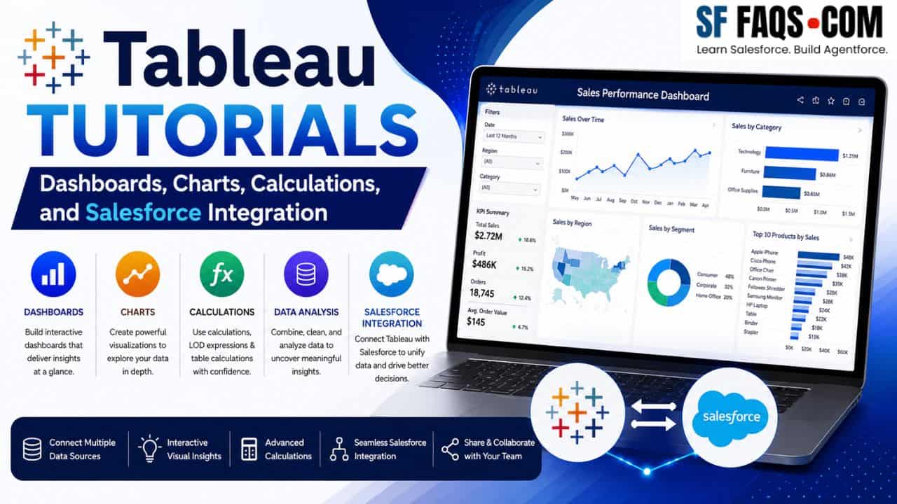
What is Tableau and How Do I Use It?
Tableau is a powerful data visualization platform that lets me connect to multiple data sources, build interactive charts and dashboards, and share them with stakeholders. With Tableau, I can:
- Connect to databases, spreadsheets, Salesforce, and other data sources.
- Clean and transform data using calculations, groups, bins, and Level of Detail (LOD) expressions.
- Build a wide range of visualizations—bar charts, line charts, maps, funnels, Gantt charts, and more.
- Assemble interactive dashboards with filters, actions, and dynamic behavior.
For Salesforce users, Tableau pairs especially well with CRM Analytics and direct Salesforce connections, giving me a complete view from raw records to executive‑level dashboards.
Key Tableau Concepts I Rely On
Before building complex dashboards, I focus on a few core concepts:
- Data Types and Basic Calculations – Understanding measures, dimensions, data types, calculated fields, and basic aggregations.
- Filters and Order of Operations – Knowing how context filters, quick filters, and order of operations affect the view.
- Level of Detail (LOD) Expressions – Using FIXED, INCLUDE, and EXCLUDE to control the granularity of calculations.
- Parameters and Dynamic Behavior – Allowing users to choose measures, dimensions, or thresholds and drive interactive logic.
- Dashboard Design – Combining multiple visualizations with filters, zone visibility, and layout best practices.
Tableau Tutorials
Below is the complete list of Tableau tutorials, grouped by topic and linked to the exact articles.
Connecting Tableau with Salesforce
When I want to bring Salesforce data into Tableau, I use this tutorial as my starting point.
Core Calculations, Data Types, and Aggregations
These tutorials cover the foundational building blocks: data types, calculated fields, IF/CASE logic, and aggregations.
- Convert Data Type in Tableau
- Tableau Calculated Field
- Tableau IF Statement
- Tableau CASE Statement
- Tableau Aggregate Functions
- Calculate Mean, Median, and Mode in Tableau
- Tableau ZN Function
- Tableau ATTR Function
- Tableau Lookup Function
- Tableau Rank Function
- Tableau Distinct Count
- Sort by Calculated Field in Tableau
- Calculate Number of Weekdays Between Dates in Tableau
- Concatenate Fields in Tableau
Data Modeling: Groups, Bins, LOD, and Order of Operations
When I need more control over granularity and grouping, I rely on these techniques.
- Create Groups in Tableau
- Bins in Tableau
- Tableau LOD (Level of Detail) Expressions
- Tableau Fixed Function
- Tableau Order of Operations
Data Preparation and Table/Data Layout Tricks
These tutorials help me shape data and views before I visualize them.
- Remove Duplicates in Tableau
- Tableau Pivot Columns
- Create a Table in Tableau
- Tableau Drill Down Table
- Rename Columns in Tableau
- Repeat Row Labels in Tableau
- Remove ABC Column in Tableau
Filters, Context, and Top N Views
Filter design has a huge impact on performance and correctness. These tutorials show how I set them up properly.
- Tableau Context Filters
- Tableau Cascading Filters
- Tableau Dashboard Filters
- Show Top N Results in Tableau
Parameters, Dynamic Zone Visibility, and Interactivity
Parameters and dynamic visibility let me build more flexible dashboards that adapt to user input.
Formatting, Conditional Formatting, and Coloring
Good formatting makes a dashboard much easier to read and explain.
Images, Maps, and Visual Enhancements
I use these features when I want more visually engaging dashboards.
Quick Table Calculations and Common Table Tricks
Table calculations can unlock powerful running totals, percent of total, and more.
Exporting and Sharing
Once I finish a report, I often need to share it as a static file.
Building Dashboards in Tableau
These tutorials focus on combining multiple visuals into a single dashboard layout.
Tableau Chart and Visualization Tutorials
Most of my Tableau work involves choosing the right chart for the question. Below are all of the chart‑specific tutorials.
Core Charts: Bar, Line, Area, Scatter, Pie
These are the fundamental visualizations I use in almost every project.
- Tableau Bar Chart
- Tableau Line Chart
- Tableau Area Chart
- Tableau Scatter Plot
- Create Pie Chart in Tableau
- Display Percentage in Tableau Pie Chart
- Tableau Pie Chart with Multiple Measures
Bar Variants: Stacked, 100% Stacked, Diverging, Side‑by‑Side, Bar‑in‑Bar
When I want to compare parts of a whole or multiple measures side by side, I rely on these patterns.
- Tableau Stacked Bar Chart
- Tableau 100% Stacked Bar Chart
- Tableau Stacked Bar Chart Multiple Measures
- Tableau Side by Side Bar Chart
- Tableau Bar in Bar Chart
- Tableau Diverging Bar Chart
- Color Tableau Bar Chart
- Sort Values in Tableau Stacked Bar Chart
- Add Total of Values in Tableau Stacked Bar Chart
Line‑ and Trend‑Based Charts
These views help me track performance over time and compare trends.
Funnel, Waterfall, and Flow‑Style Visuals
When I want to communicate stages, drop‑offs, and contributions, I use these charts.
- Tableau Funnel Chart
- Tableau Funnel Chart with Multiple Measures
- Tableau Waterfall Chart
- Multiple Measures Waterfall Chart in Tableau
- Tableau Sankey Chart
Distribution and Statistical Charts
For distributions, outliers, and ranges, I use these visualizations.
- Tableau Histogram
- Tableau Box and Whisker Plot
- Tableau Bullet Chart
- Tableau Gantt Chart
- Tableau Gantt Chart with Milestones
- Tableau Gantt Chart Start and End Date
- Tableau Gauge Chart
Advanced and Custom Charts
These tutorials cover more advanced chart types that are great for storytelling and executive dashboards.
- Tableau Combination Chart
- Tableau Dual Axis Chart
- Tableau Barbell Chart
- Tableau Radar Chart
- Tableau Candlestick Chart
- Tableau Trellis Chart
- Tableau Waffle Chart
- Tableau Butterfly Chart
- Tableau Pareto Chart
- Tableau Bump Chart
- Tableau Radial Bar Chart
- Tableau Lollipop Chart
- Tableau Heat Map
- Tableau Tree Map
- Tableau Bubble Chart
- Tableau Sunburst Chart
- Tableau Donut Chart
- Tableau Circle Timeline Chart
Dashboard‑Level Patterns and Controls
Finally, I use these tutorials to control dashboard behavior and filters.
CRM Analytics vs Tableau
If I’m working in a Salesforce‑heavy environment, this comparison helps me choose the right tool.
Suggested Learning Path for Tableau
If you are not sure where to start, this is the progression I recommend:
- Begin with core calculations and data types: calculated fields, IF/CASE, aggregations, distinct counts, and date calculations.
- Learn groups, bins, LOD expressions, and order of operations to control data granularity.
- Move into filtering and parameters: context filters, cascading filters, dashboard filters, and multiple‑select parameters.
- Build core charts first (bar, line, area, scatter, pie), then expand into stacked, dual‑axis, and funnel/waterfall views.
- Start assembling dashboards with dynamic zone visibility, images, and clear formatting.
- Finally, explore advanced charts (radial, trellis, waffle, Gantt, Pareto, Sankey) as your storytelling needs grow.
Following this path, I can go from basic charts to highly polished, interactive Tableau dashboards that work well with Salesforce and other enterprise data sources.
