You may have created a useful Salesforce report, but asking users to open and run reports every day is not always practical.
Most managers and team leads prefer to see important numbers and charts on a dashboard so they can quickly understand the current business situation.
Salesforce dashboards help you convert report data into visual components such as charts, gauges, metrics, and tables. Instead of opening multiple reports, users can view key information from a single dashboard page.
In this article, you’ll learn:
- How to add a report as a dashboard component in Salesforce Lightning Experience
- How to add a report to a dashboard in Salesforce Classic
- Which dashboard component type to choose for different reporting needs
- Common mistakes that prevent reports from displaying correctly on dashboards
- Best practices used by Salesforce Administrators to build useful dashboards
Whether you’re a Salesforce Administrator, Business Analyst, or Developer, this step-by-step guide will help you create dashboards that users actually use for daily decision-making.
Prerequisites Before Adding a Report to a Dashboard
Before adding a report as a dashboard component, make sure the following requirements are met:
- The report is created and saved successfully.
- The report returns the correct data based on your filters.
- You have permission to create or edit dashboards.
- You have access to the report folder.
- The report is stored in a folder accessible to the intended dashboard users.
If your report is still rough — wrong filters, missing groupings, bad field names — fix that first. It’s much faster to clean up the report than to fight with a broken dashboard.
Report Format Requirements
Different dashboard components require different report formats:
- Summary Reports – Recommended for most dashboard charts.
- Matrix Reports – Useful for advanced charting and comparisons.
- Tabular Reports – Can be used for tables and metrics, but chart options are limited.
Important: If your report does not contain any grouping, Salesforce may not allow certain chart types, such as Bar Charts, Pie Charts, or Stacked Charts.
Before moving to the dashboard, spend a few minutes validating your report filters, groupings, and summary fields. Fixing report issues first is much easier than troubleshooting dashboard components later.
How Salesforce Dashboards Use Reports
Every dashboard component is built using two elements:
- Source Report – The report that provides the data.
- Dashboard Component – The visual format used to display that data.
A single Salesforce report can be used in multiple dashboard components. For example, one report can be displayed as a Bar Chart, Metric, and Table on the same dashboard.
The overall process is simple:
- Create or open a report.
- Add the report to a dashboard component.
- Select a suitable chart or display format.
- Save and refresh the dashboard.
Once configured, Salesforce automatically displays the report data through the selected dashboard component.
How to Add a Salesforce Report as a Dashboard Component
Follow the steps below to add a Salesforce report to a dashboard component in Lightning Experience.
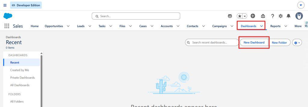
Step 1: Open or Create a Dashboard
- Click the App Launcher (9-dot icon).
- Search for and select Dashboards.
- Open an existing dashboard and click Edit, or click New Dashboard to create a new one.
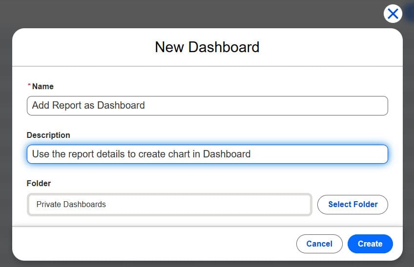
If you’re creating a new dashboard:
- Enter a meaningful dashboard name.
- Select a folder that your users can access.
- Click Create.
The dashboard editor opens, where you can start adding components.
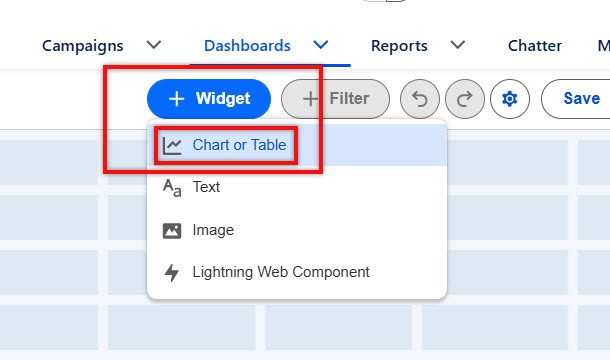
Step 2: Click + Widget
In the dashboard editor, click + Widget. Here you can choose the component to create the dashboard. We need to select a chart or table to provide data for the dashboard component.
Step 3: Select a Report
Search for and select the report you want to display on the dashboard.
Before selecting the report, verify that:
- The report is saved.
- The report folder is accessible to you.
- The report contains the correct filters and groupings.
After selecting the report, click Select.
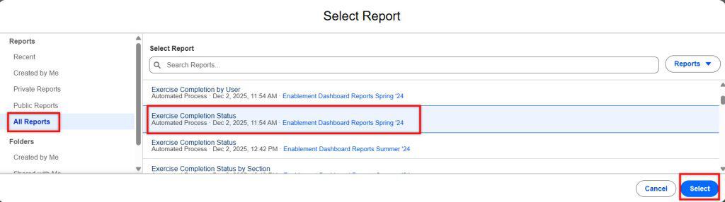
Note: If the report does not appear in the list, check whether it has been saved and whether you have access to the report folder.
Step 4: Choose a Dashboard Component Type
Next, select how you want the report data to be displayed on the dashboard.
Common dashboard component types include:
- Bar Chart – Compare data across owners, stages, regions, or categories.
- Donut Chart or Pie Chart – Display percentages and proportions.
- Metric – Show a single important value.
- Gauge – Track progress against a target value.
- Table – Display a list of top records.
For example:
| Requirement | Recommended Component |
|---|---|
| Open Cases by Owner | Bar Chart |
| Cases by Priority (%) | Donut Chart |
| Total Open Pipeline | Metric |
| Sales Target Progress | Gauge |
| Top Opportunities | Table |

Choose the component that best answers the business question and click Add.
Important: Some chart types require a Summary Report or Matrix Report. If your report is a Tabular Report without groupings, certain chart options may not be available.
Step 5: Configure the Component
After selecting the component type, configure its settings.
You can:
- Enter a Title and Subtitle.
- Select the report grouping for the chart.
- Choose the summary field to display.
- Configure chart settings such as:
- Show Values
- Show Percentages
- Sort Order
Use meaningful titles that clearly explain the information being displayed.
Example:
❌ Cases_Report_1
✅ Open Cases by Agent – This Week
Clear titles make dashboards easier for users to understand.
Step 6: Arrange the Component on the Dashboard
After adding the component, it appears on the dashboard canvas.
You can:
- Drag and move the component.
- Resize it as needed.
- Position related components together.
A common best practice is to place key metrics and summary charts at the top of the dashboard and detailed tables lower down the page.
Step 7: Save and Refresh the Dashboard
Once the dashboard layout is complete:
- Click Save.
- Click Done to exit edit mode.
- Click Refresh to display the latest report data.

The report has now been added as a dashboard component and will be visible to users with access to both the dashboard and the source report.
Add a Report to a Dashboard in Salesforce Classic
If you’re still on Classic, the process looks different, but the idea is the same: a dashboard component is a visual built on top of a report.
Step 1: Open the Dashboard You Want to Edit
- Click the Dashboards tab.
- Click the dashboard you want to update.
- Click Edit.
You’ll see the dashboard canvas with a list of available components and data sources on the side.
Step 2: Drag a Component Type onto the Dashboard
On the left side, under the Components tab:
- Choose a component type (Chart, Table, Metric, Gauge, etc.).
- Drag it onto an empty space on the dashboard grid.
- Drop it where you want the component to live.
You’ll see a placeholder appear.
Step 3: Drag a Report onto the Component
Now switch to the Data Sources tab on the left.
- Find the report you want to use.
- Drag the report from the Data Sources list onto the component placeholder you just added.
This links the component to the report.
Step 4: Configure the Component
After connecting the report, a configuration window will open.
Here, you can:
- Set the Component Title and optional Footer
- Choose which summary field from the report to show (for example, RowCount or Sum of Amount)
- Select the grouping to use for the chart axis (if your report has groupings)
- Adjust the formatting:
- Show values
- Show percentages
- Sort order
- For gauges, define minimum, maximum, and target ranges
Once you’re done configuring:
- Click OK.
The component will update on the dashboard canvas.
Step 5: Save and Refresh
When you’ve placed and configured all the components you need:
- Click Save to save the dashboard layout.
- Click Done or Close the editor.
- Click Refresh on the dashboard to see the latest data.
Now your classic dashboard shows your report visually for anyone with access.
Choosing the Right Component Type for Your Report
Here’s a quick guide for picking the right visualization based on what your report does.
- Metric
- Use when you want a single number.
- Examples: total open cases, total pipeline, total closed-won revenue this month.
- Gauge
- Use when there’s a goal or target.
- Examples: progress toward a monthly sales target, number of cases closed vs target.
- Bar or Column Chart
- Use for comparisons across people or categories.
- Examples: open cases by owner, opportunities by stage, revenue by region.
- Stacked Bar Chart
- Use to compare across categories and see a breakdown inside each bar.
- Example: open cases by owner, broken down by priority.
- Donut or Pie Chart
- Use when you care about proportions.
- Example: percentage of cases by priority or by channel (phone, email, web).
- Table
- Use for “top N” lists.
- Example: top 10 opportunities by amount, oldest 20 open cases.
If you’re ever unsure, start with a simple bar chart. It’s the most universally useful and easiest to read.
Admin Tips for Better Dashboards
Over the years, working with U.S.-based teams (support managers in Chicago, sales leaders in Austin, operations folks in Seattle), a few patterns have worked really well:
- Use plain-English titles. A dashboard component named “Open Cases by Agent – Last 7 Days” is used. One named “CS_Case_Report_01” does not.
- Keep dashboards focused. It’s better to have three dashboards with clear themes (Sales, Service, Exec Summary) than one monster dashboard with 20 unrelated components.
- Put the most important metrics at the top. People rarely scroll all the way down. Your key numbers should be visible without scrolling.
- Match filters between reports and dashboards. If your dashboard is “Support – This Week,” make sure all source reports are filtered to the same timeframe.
- Train your managers. Spend 10 minutes showing them:
- How to read each component
- How to click through to the underlying report
- How to use dashboard filters (if you’ve added them)
That small investment means your dashboards actually get used instead of becoming clutter.
Common Mistakes to Avoid
Here are a few issues I see a lot, plus how to avoid them:
- Using ungroupped tabular reports for charts.
- Without groupings, your chart options are limited.
- Fix: Turn the report into a Summary report and group by the field you care about (Owner, Stage, Region, etc.).
- Adding too many components to one dashboard.
- A dashboard with 20 tiny charts is overwhelming.
- Fix: Focus each dashboard on a handful of questions and keep it clean.
- Inconsistent folders.
- If the report and dashboard are in folders with different sharing settings, some users will see the dashboard tile but get errors when clicking through.
- Fix: Make sure both the dashboard and its source reports reside in folders shared with the same audience.
- Not refreshing dashboards.
- In some orgs, dashboards don’t auto-refresh; they show old data.
- Fix: Either schedule dashboard refreshes (where available) or remind users to click Refresh when they open it.
- Using vague titles.
- “Cases Report” doesn’t tell anyone what they’re looking at.
- Fix: Add who/what/when to the title (for example, “High Priority Cases – US Support – This Week”).
What to Do Next
Now that you know how to add a report as a dashboard component, a few natural next steps:
- Create a Service Overview dashboard with:
- Open cases by owner
- Open cases by priority
- Average case age
- Build a Sales pipeline dashboard with:
- Pipeline by stage
- Top 10 opportunities
- Closed-won this month
- Schedule the dashboard (or its source reports) to email your managers on a regular cadence so they don’t have to hunt for data.
Once you’ve got a few solid dashboards in place, people will start asking, “Can you add this metric too?” That’s a good sign — it means your Salesforce reports and dashboards are finally being used as real decision-making tools, not just as a dumping ground for data.
Conclusion
Adding a Salesforce report as a dashboard component is one of the easiest ways to make your reports more useful and easier to understand. Instead of opening reports one by one, users can view important business data in charts, tables, gauges, and metrics directly from a dashboard.
In this guide, you learned how to add a report to a dashboard in both Salesforce Lightning Experience and Salesforce Classic, choose the right dashboard component type, and avoid common mistakes that can affect your dashboard.
We hope this guide helped you understand how to add a Salesforce report as a dashboard component. If you’re learning Salesforce Reports and Dashboards, check out our other tutorials on creating reports, building dashboards, dashboard filters, dynamic dashboards, and scheduling reports to improve your reporting skills even further.
You may like to read:
- Lightning Table Dashboard Component in Salesforce
- How to Create Stacked Bar Charts Dashboard in Salesforce
- Configure Dashboard Data Visibility in Salesforce
- Create a Home Page in Salesforce
I am Bijay Kumar, the founder of SalesforceFAQs.com. Having over 10 years of experience working in salesforce technologies for clients across the world (Canada, Australia, United States, United Kingdom, New Zealand, etc.). I am a certified salesforce administrator and expert with experience in developing salesforce applications and projects. My goal is to make it easy for people to learn and use salesforce technologies by providing simple and easy-to-understand solutions. Check out the complete profile on About us.
